TYPE
BRAND IDENTITY
CLIENT
ÉVORA HOTEL
DATE
2015
DESIGN
FRANCISCO SALGADO RÉ
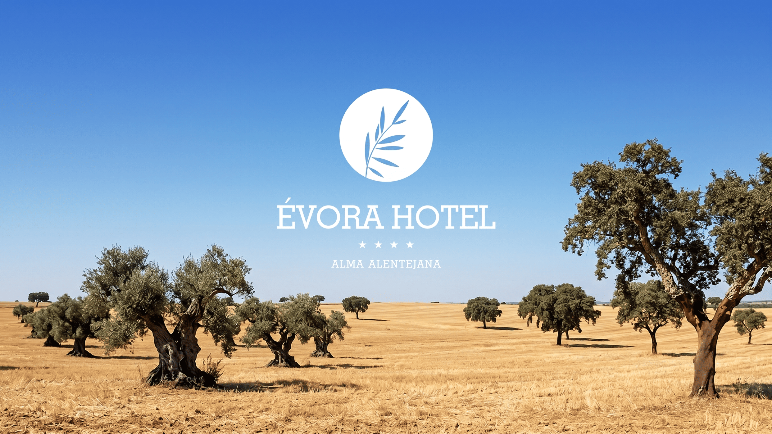
The rebranding project for Évora Hotel stems from a deep immersion into the identity and atmosphere of the Alentejo, translating into a visual manifesto that celebrates the region’s authenticity. The creative concept stands as an ode to nature and an explicit invitation to slow living, where graphic design acts as a bridge between the territory’s historical legacy and the sophistication demands of contemporary hospitality.
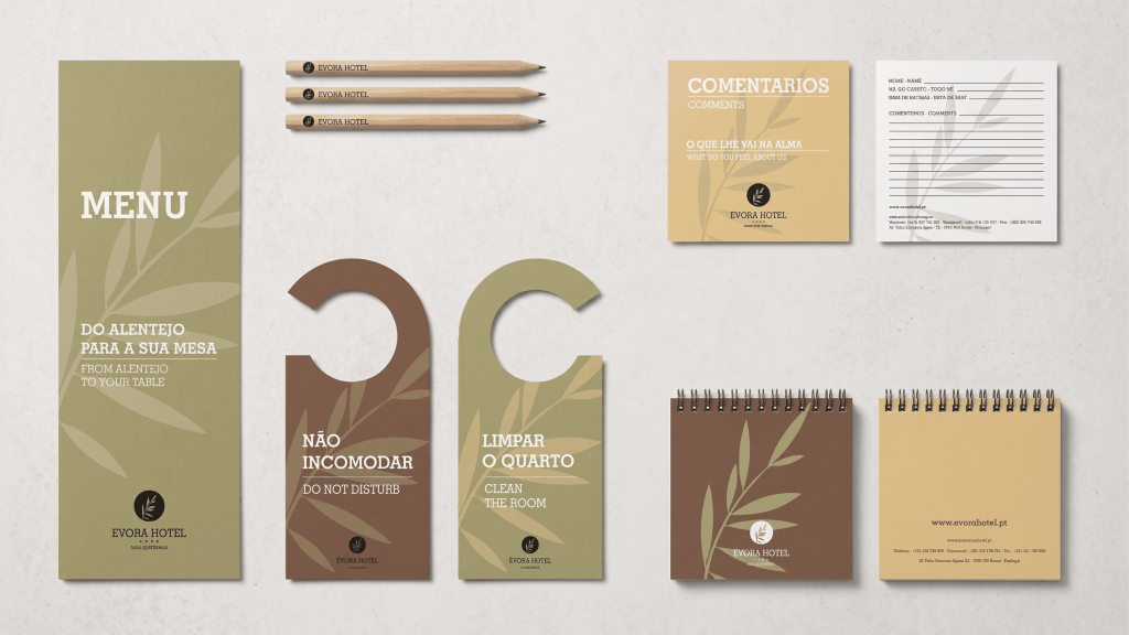

Anchored in the heart of the Alentejo landscape, the development of the new visual identity was based on a rigorous research of local tangible and intangible heritage. Elements of the native flora were stylized and integrated into the brand’s iconography, while the chromatic palette drew direct inspiration from the surroundings: the earthy tones of the ground, the purity of lime wash, and the sobriety of vegetation, lending a strong organic root to the project.


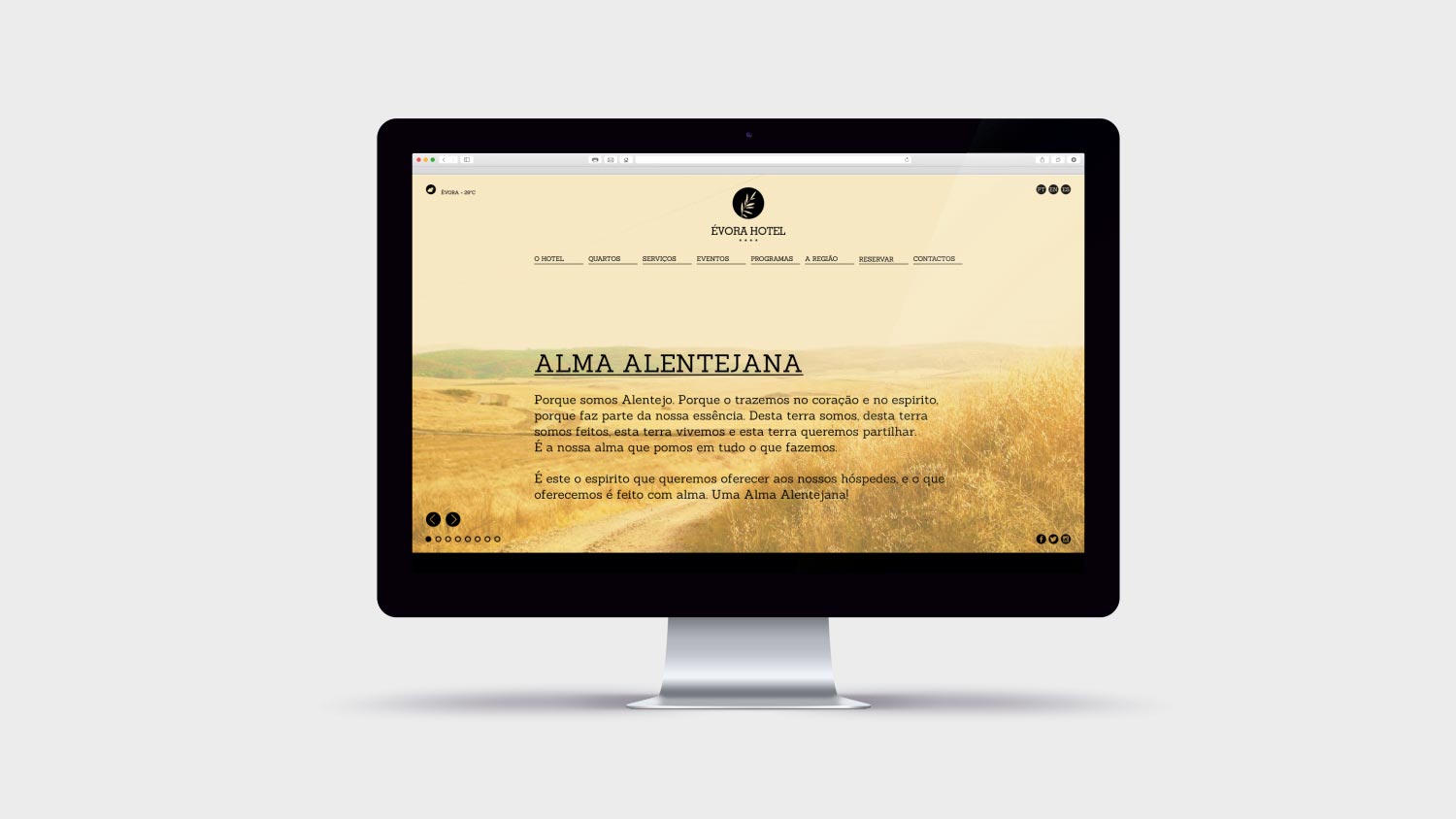
The brand design seeks a geometric and conceptual balance between modern minimalism and respect for tradition. Through refined typography and a timeless visual language, the new brand communicates elegance without excess. Every graphic application — from institutional stationery to digital mediums and signage — was designed to convey a sense of order, clarity, and permanence.


More than an aesthetic renewal, the new identity consolidates the strategic positioning of Évora Hotel as a sanctuary of stillness and sustainability. The brand now communicates a promise of an integrated experience, where time takes on a new pace and the connection to the territory becomes the core element of the stay, establishing the hotel as a benchmark destination in wellness tourism.