PROJECT: BRAND IDENTITY
CLIENT: tabua-rasa.com
DATE: 2015-26
scope: Visual Identity, Brand Strategy, Custom Logomark, Vector Illustration System, and Interior Integration
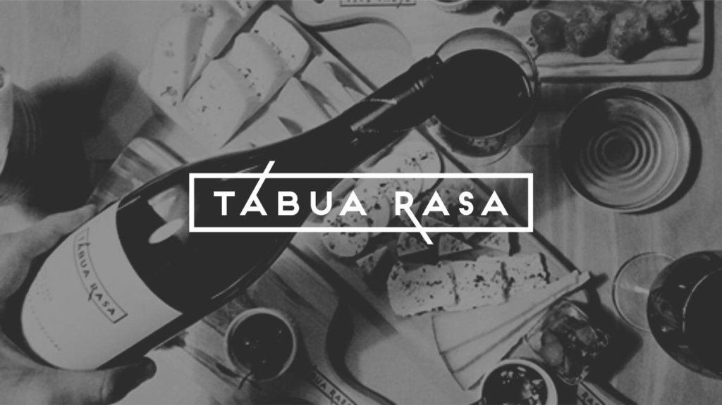
The visual identity for Tábua Rasa translates a culinary concept focused on artisanal quality, slow food, and curated wines into a simple, objective graphic framework. Designed to embed the restaurant’s unpretentious ethos into every physical and digital touchpoint, the identity extends seamlessly across stationery, printed menus, custom wooden serving boards, and interior architectural features.

The naming strategy operates across three distinct semantic layers. Literally, tábua refers to the flat wooden board serving as the primary vessel for regional charcuterie and cheeses. Conceptually, it references the Latin tabula rasa—a clean slate symbolizing a fresh, authentic approach to traditional gastronomy. Historically, the name honors the medieval woodworking heritage of the restaurant’s location, where neighboring master carpenters crafted the custom furniture for the space.


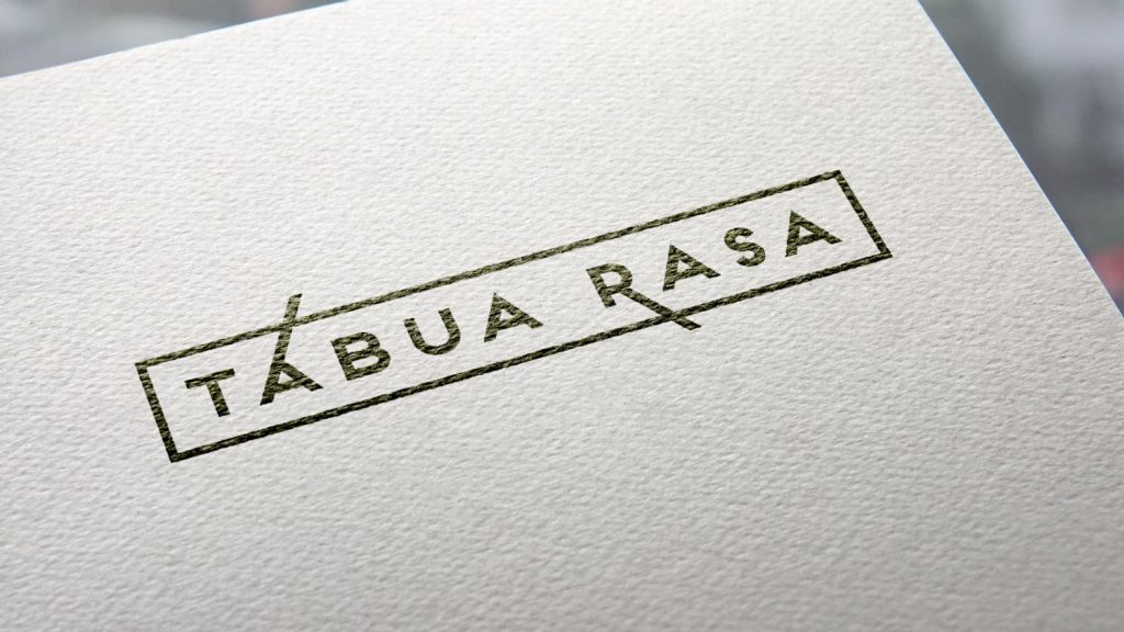
The logomark directly reflects the physical geometry of a food board, integrating extended vertical strokes in the letters ‘A’ and ‘R’ as a subtle graphic metaphor for cutlery. Brand communication, event promotion, and digital dissemination are anchored by a unified vector illustration system focused on cheese and charcuterie themes, maintaining visual coherence and instant recognition across all media.