PROJECT: CORPORATE IDENTITY
CLIENT: PROCURADORIA GERAL DA REPÚBLICA
DATE: 2016
STATUS: COMPLETED
AWARD: 1st PRIZE DESIGN COMPETITION
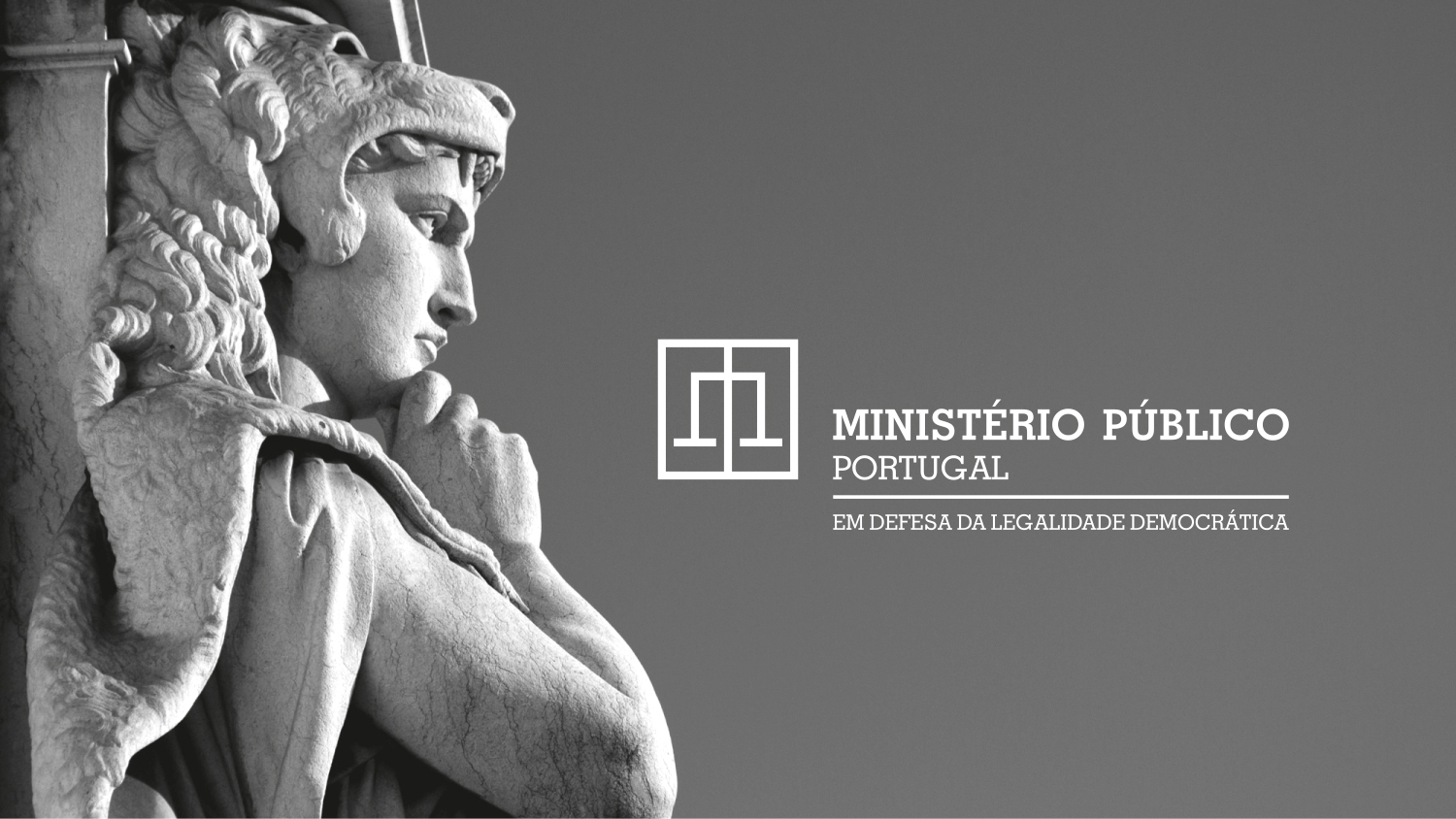
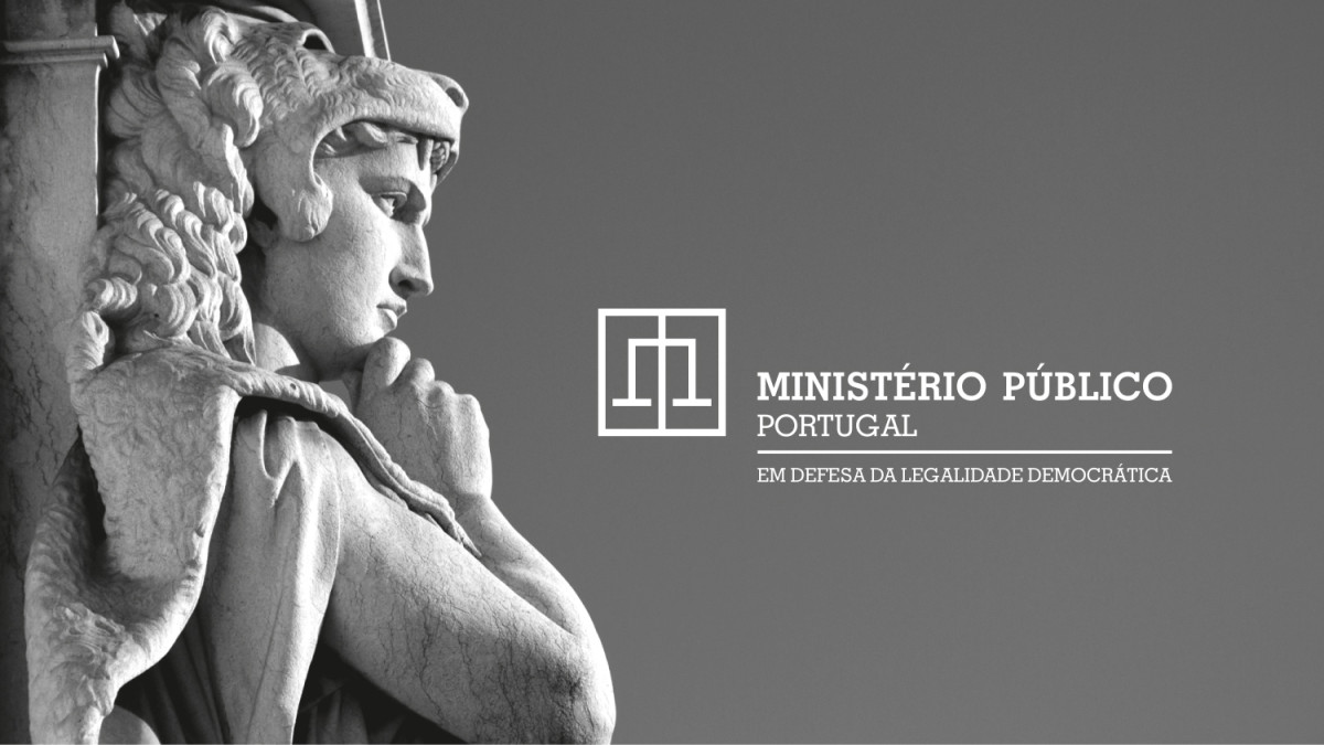
A coherent and expansive visual identity system for the Portuguese Public Prosecution Service, translating institutional autonomy, democratic rigor, and citizen proximity into a unified graphic language.


The Public Prosecution Service (Ministério Público) is an autonomous, independent magistracy within the Portuguese judicial system, tasked with upholding democratic legality and guaranteeing equality before the law. The strategic goal of the rebranding was to bridge the institution with the general public. By replacing fragmented visual expressions with a single, transparent, and objective graphic language, the design establishes an approachable civic presence while maintaining institutional dignity.


The design concept translates the four core principles governing the institution—Autonomy, Responsibility, Hierarchy, and Stability—into a precise graphic syntax. The identity balances formal sobriety with visual dynamism:
Sobriety and Balance: Clean geometric structures and unadorned typography reflect stability, impartiality, and legal rigor. Modernity and Service: A contemporary visual hierarchy shifts the tone from cold bureaucracy toward active civic engagement and clarity.


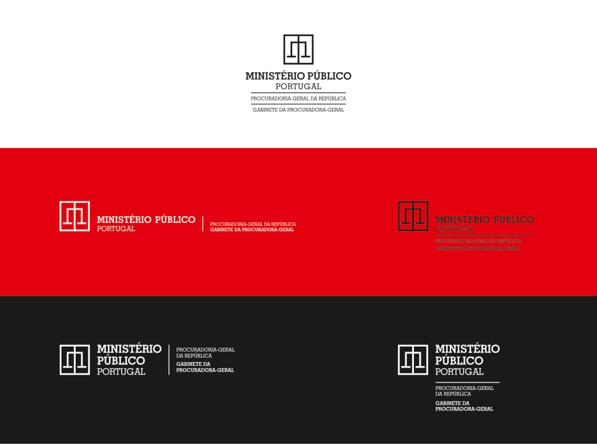
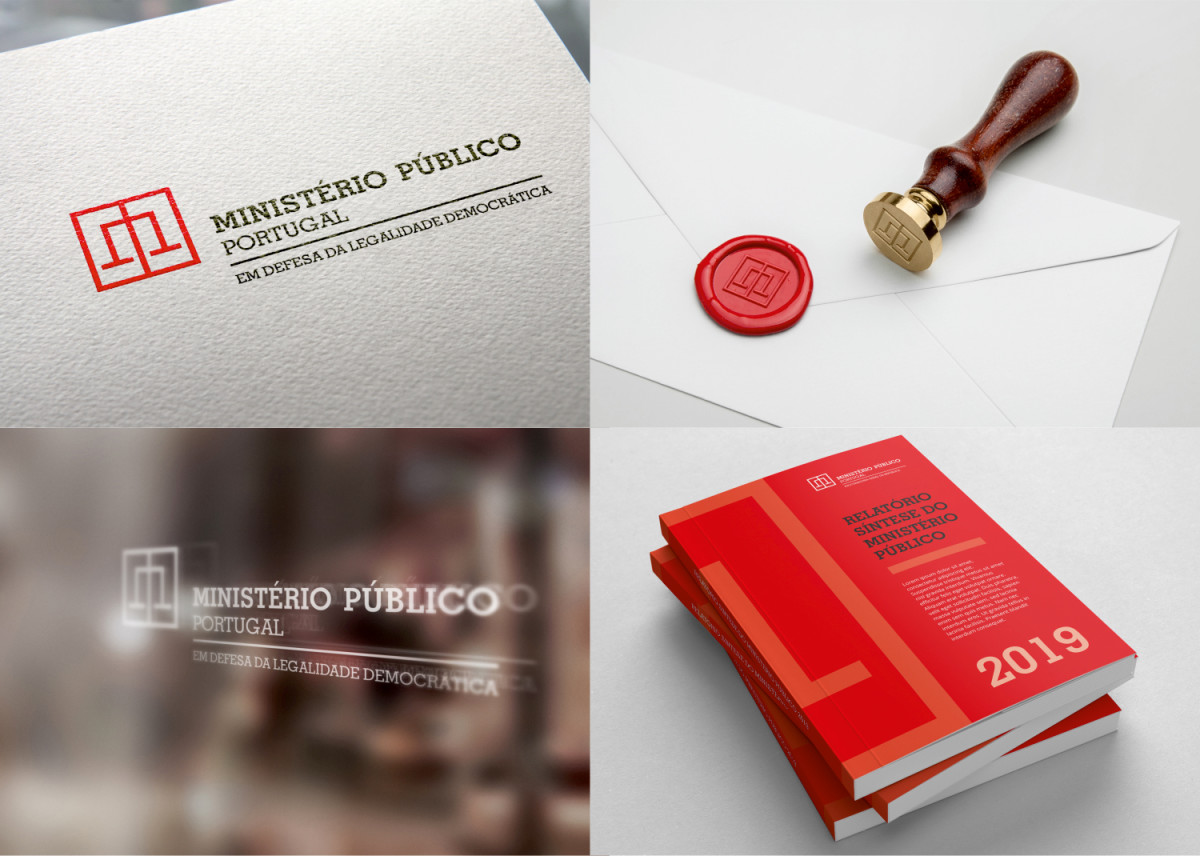
To address the extensive administrative scale of the Public Prosecution Service, the identity operates as an expansive, unitary system. Rather than creating disparate visual silos, the framework provides a standardized yet adaptable set of graphic rules that extend seamlessly across all departments, regional prosecutor’s offices, and specialized judicial units. This transversal strategy ensures immediate public recognition and visual coherence across all physical, editorial, signage, and digital touchpoints.