PROJECT: BRAND IDENTITY

CLIENT: kal -matalurgia

DATE: 2014


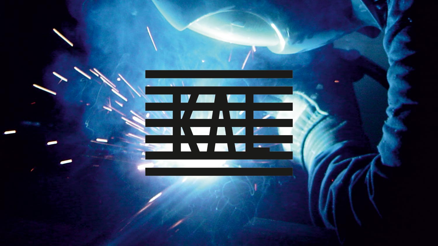
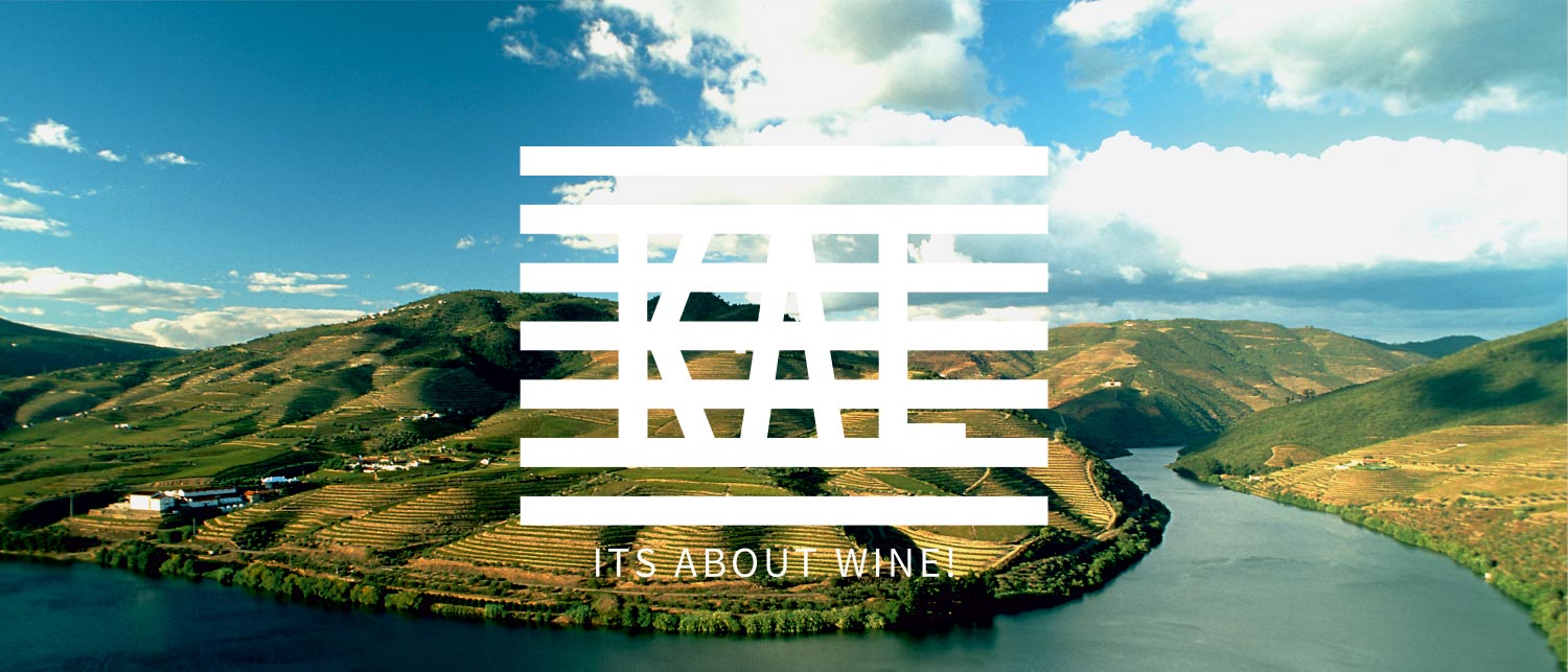
KAL is a specialized metallurgical manufacturing company primarily dedicated to producing structural equipment and hardware for the wine industry. The visual identity establishes a direct dialogue between heavy industrial fabrication and agricultural enology. By contrasting the high-heat process of metal welding with the terraced landscapes of viticulture, the brand language situates the company’s technical output within its functional physical environment.

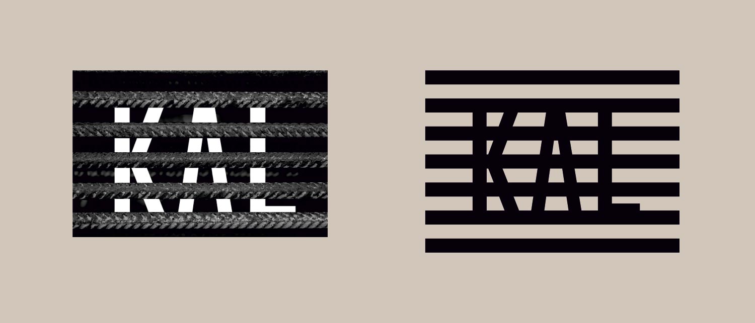
The central logomark derives its geometry from extruded metal profiles and industrial linear grates. Built upon a rigid matrix of parallel horizontal bars, the wordmark “KAL” emerges through precise negative cuts across the linear sequence. This structural pattern mimics physical steel sections, embodying material density, mechanical strength, and manufacturing precision.

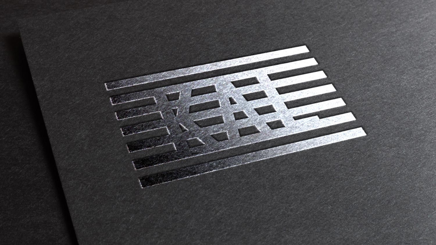
The identity extends across physical touchpoints through high-contrast tactile finishes and dynamic pattern repetition. On stationery and business cards, the horizontal bar motif expands into a full-surface linear grid. The material quality of raw steel and fabrication is translated into editorial print through metallic silver foil stamping on dark textured stocks, reinforcing the connection between graphic surface and industrial metallurgy.